

Creating a seamless user experience (UX) is crucial to the success of any website design. A well-designed website not only attracts visitors but also keeps them engaged, encourages them to explore, and ultimately converts them into customers. In this guide, we’ll walk you through five actionable steps to enhance your website’s UX, covering site navigation, load times, mobile responsiveness, and content layout. Implementing these strategies will not only improve user satisfaction but also boost your search engine rankings, helping your website reach a wider audience.
If you’re looking for a web design agency or website designers near me, these tips are essential to consider in your next website development project.

1. Optimise Site Navigation for Better User Experience
A clear and intuitive site navigation is essential for a successful website design. It ensures visitors can easily find what they need, improving both user experience and SEO. Here’s how to optimise your site navigation:
- Simple Menu Structure: Keep your website menu straightforward and logically organised. This helps users navigate easily and aids search engines in crawling your site more effectively.
- Search Bar: Include a search bar for content-rich sites. It allows users to quickly find specific information, enhancing their experience and supporting your SEO efforts.
- Breadcrumbs: Implement breadcrumbs to show users their location on your site. This makes navigation easier and improves internal linking for SEO.
Optimising site navigation is crucial for enhancing user experience and improving your website’s search engine performance.
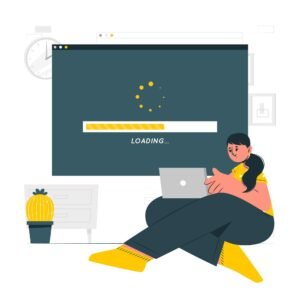
2. Enhance Page Load Times
Fast page load times are crucial for keeping users engaged and improving your website’s performance. Slow websites lead to high bounce rates and lower search engine rankings. Here’s how to speed up your site:
- Compress Images: Large image files slow down your site. Use image compression tools like TinyPNG to reduce file sizes without losing quality, improving both load times and SEO performance.
- Enable Browser Caching: Implement browser caching to store parts of your site in users’ browsers, reducing load times for returning visitors and boosting your site’s speed.
- Minimise HTTP Requests: Reduce the number of scripts, images, and CSS files on your pages to decrease HTTP requests. This streamlines your website design, leading to faster load times and better SEO.
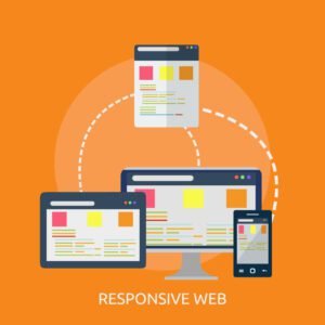
3. Ensure Mobile Responsiveness
With the rapid rise in mobile internet usage, making your website mobile-friendly is no longer optional—it’s essential. A mobile-responsive website automatically adjusts its layout, images, and functionality to fit different screen sizes, whether users are viewing it on a smartphone, tablet, or desktop. Ensuring that your website provides a consistent and seamless experience across all devices is key to retaining visitors and improving engagement.
- Adopt a Mobile-Responsive Design
- Implement responsive web design techniques to enable your site to adapt seamlessly to any screen size, from smartphones to large desktop monitors.
- A responsive design optimises not just the layout, but also images, content, and navigation for smaller screens.
- Consider hiring a web design agency with expertise in mobile-responsive design if you’re planning to design a website that meets the demands of modern users.
- Test on Multiple Devices
- Regularly check your website on various screen sizes, including smartphones, tablets, and desktops, to identify and resolve any issues that may hinder the user experience.
- This is especially important if you’re a business owner searching for “website designers near me” or a developer looking to perfect a website development project.
- Ensuring your site performs well across all platforms guarantees a smooth and consistent experience for all users.
- Simplify Mobile Navigation
- Use a hamburger menu or collapsible sections to simplify navigation on smaller screens, making it easier for users to explore your site on mobile devices.
- A well-structured and intuitive navigation system is critical for mobile-responsive websites and enhances overall usability.
- When planning a website redesign or a new website development project, prioritising mobile navigation can significantly improve the user experience.

4. Focus on Content Layout
A well-structured content layout enhances readability and keeps users engaged. Here’s how to organise your content effectively:
- Use Headings and Subheadings: Break up your content with headings and subheadings to guide readers through your site. This not only improves readability but also helps with SEO.
- Incorporate White Space: Don’t cram too much content into a single page. Use white space to give your content room to breathe, making it easier on the eyes.
- Prioritise Visual Hierarchy: Arrange elements on your page in order of importance, ensuring key information stands out.

5. Engage Your Audience
Creating a website that fosters engagement encourages users to spend more time on your site, explore your content, and return in the future. Here’s how to effectively engage your audience:
- Add Interactive Elements: Consider adding interactive elements such as quizzes, surveys, or polls to keep users engaged. These features enhance the user experience and encourage visitors to interact with your website design.
- Enable Comments and Reviews: Allow users to leave comments or reviews on your blog posts or products. This not only creates a sense of community but also boosts SEO by generating fresh content. User-generated content is valuable for web design as it increases website visibility in search engines.
- Incorporate Call-to-Action Buttons: Guide users towards desired actions with clear and compelling Call-to-Action (CTA) buttons such as “Sign Up,” “Learn More,” or “Contact Us.” These buttons are crucial for website development and are designed to improve conversion rates, making it easier for visitors to take the next step.
- Optimise for Mobile: Ensure all interactive elements, comments, and CTA buttons are mobile-friendly. This is essential for web design agencies as mobile optimisation significantly impacts user engagement and SEO rankings.
- Use Social Sharing Tools: Integrate social media sharing buttons to encourage visitors to share your content. This not only increases your reach but also enhances your website’s SEO performance by driving more traffic.
- Create Engaging Content: Regularly update your website with relevant and high-quality content that resonates with your target audience. Engaging content is key to successful website design and helps keep visitors on your site longer, reducing bounce rates and improving search engine rankings.
Final Thoughts
Improving your website’s user experience is an ongoing process that demands attention to detail and a user-centred approach. By optimising site navigation, page load times, mobile responsiveness, content layout, and audience engagement, you’ll not only enhance user satisfaction but also boost your website’s visibility in search engine results.
At Weblinerz, we specialise in creating websites that are both visually stunning and highly functional. Whether you’re looking to design a website from scratch or improve an existing one, our expert website developers and web design team are here to help. We focus on delivering mobile-responsive, SEO-optimised solutions that drive results.
Ready to take your website’s UX to the next level? Contact Weblinerz today to learn how we can help you create a seamless and engaging user experience that drives results.